Overview
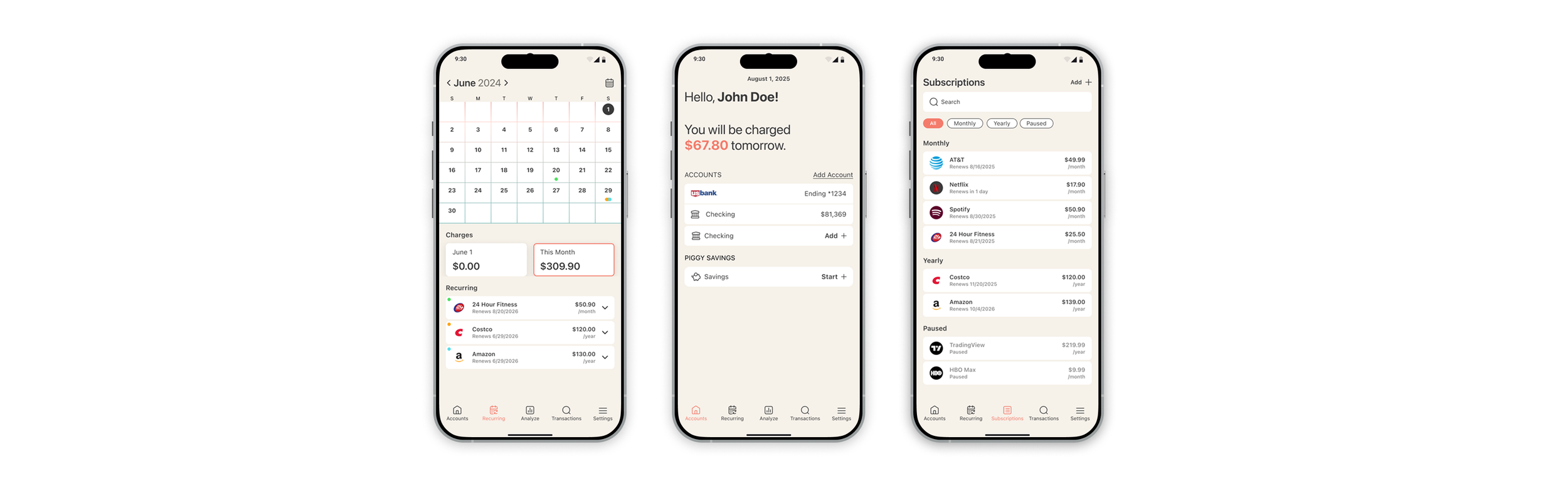
Piggy’s core objective is to provide users with a centralized dashboard to view all their active subscriptions in one place. This comprehensive visibility empowers users to make informed financial decisions. The company also plans to introduce features that allow users to easily unsubscribe from unwanted services and receive timely notifications about upcoming auto-renewals, giving them more control over their spending
Timeline
4 weeks
Research Synthesis
Survey Questions
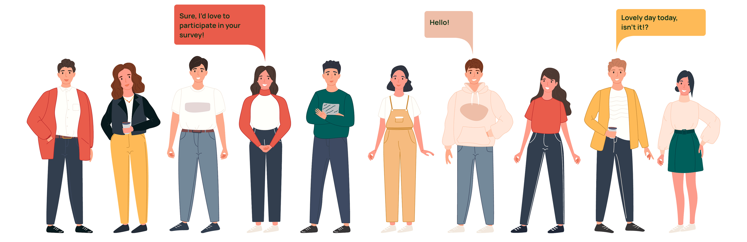
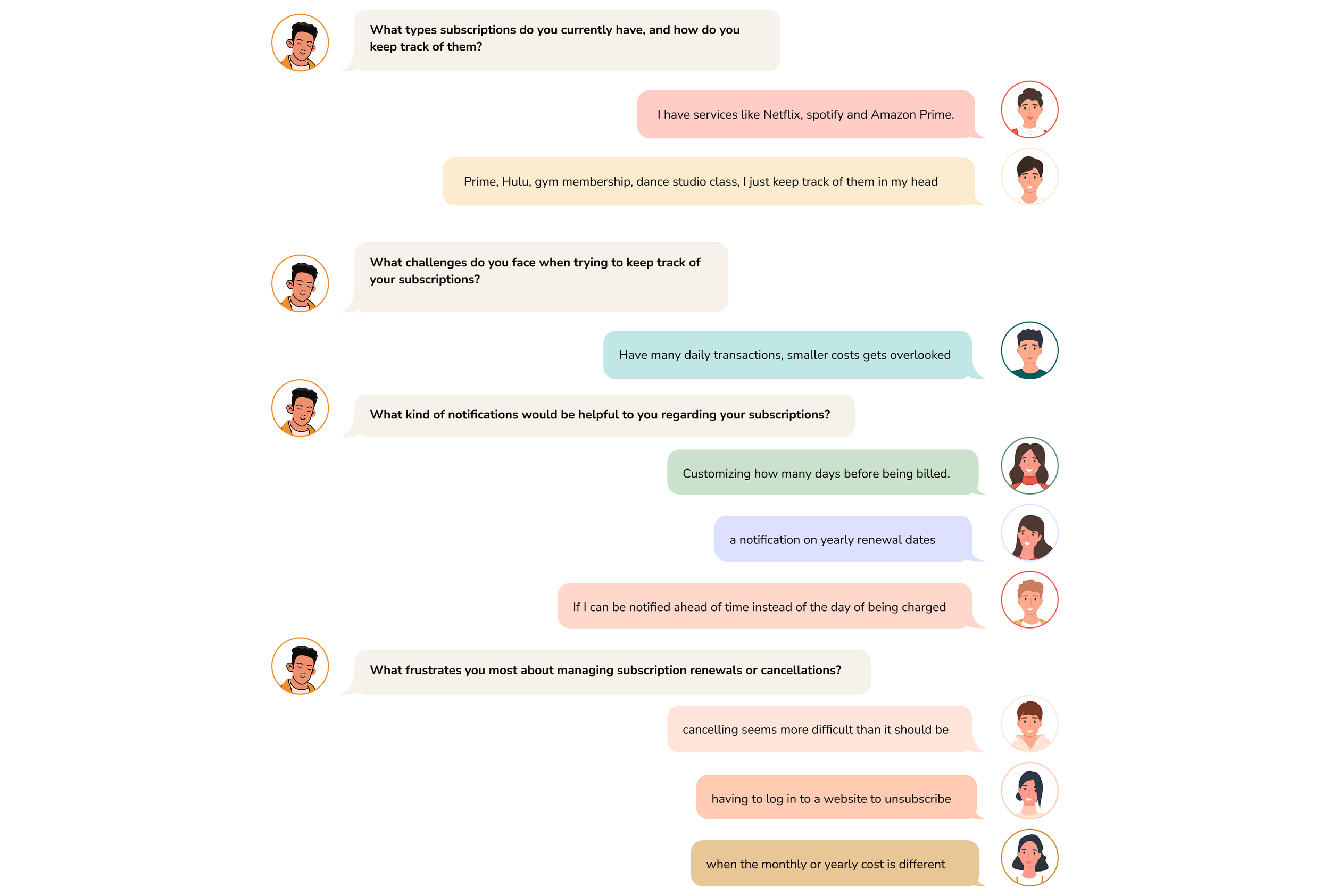
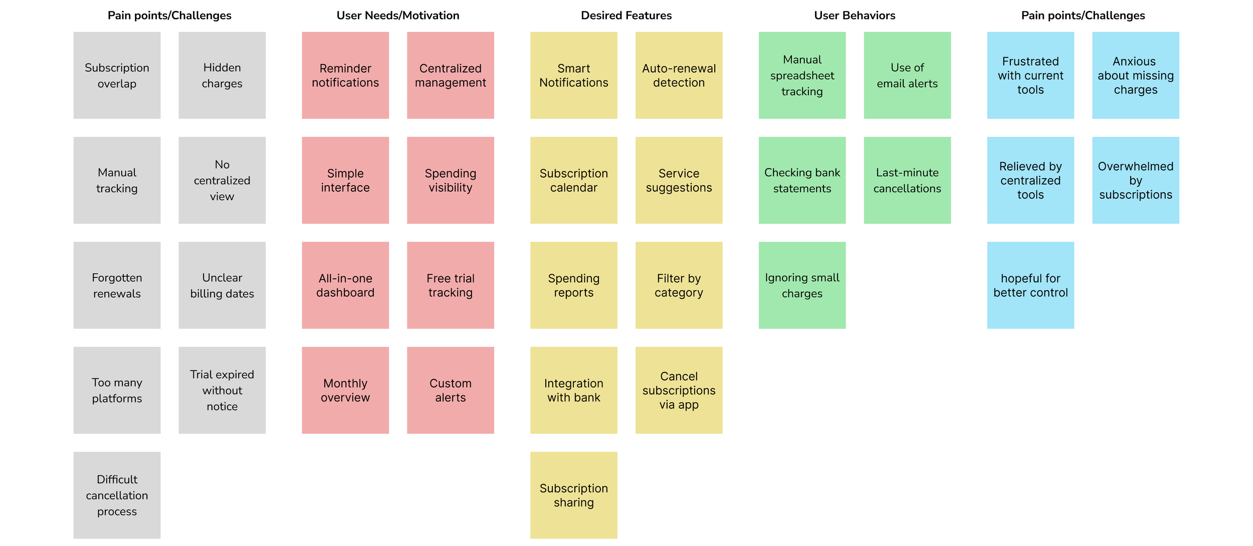
To better understand our users, I conducted a survey with 10 participants both in-person and remote.
Here are some answers from the participants to my survey research questions. I was able to gather strong qualitative data.
Quantitative Analysis
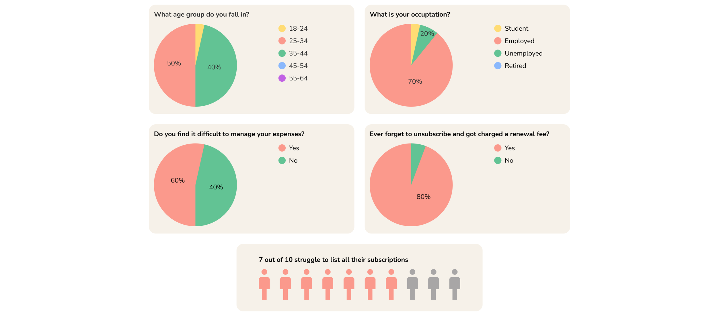
To better understand user’s behavior, I created a Google form with 11 multiple choice questions to receive more rigid statistical data from participants. I had a total of 10 partipants. This analysis helped uncover behavior through data.
Thematic Analysis
With enough quantitative and qualitative data, I synthesized insights through thematic analysis, allowing me to focus on user-centered design and translate findings into design solutions.
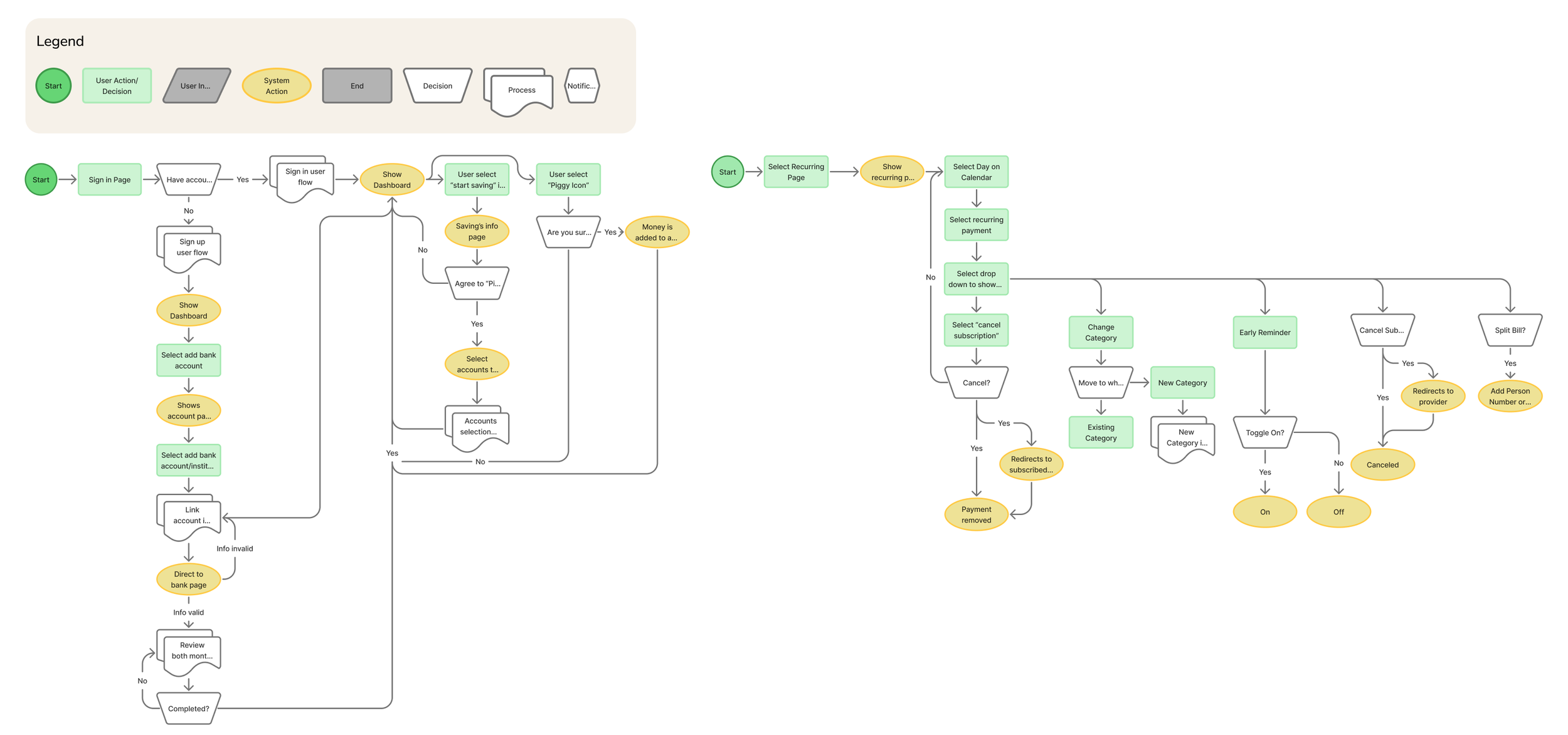
Wireflow
With enough quantitative and qualitative data, I synthesized the findings and identified recurring patterns through thematic analysis.
Design
Low Fidelity Prototype
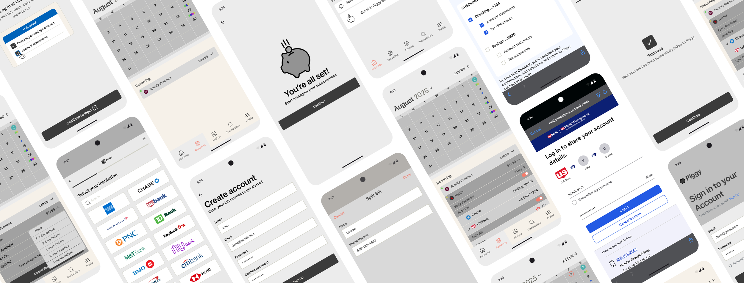
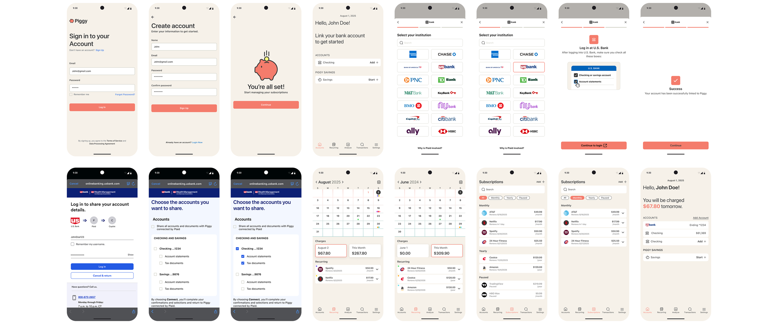
Using wireflows as a guide, I heavily focused on creating a workable low fidelity prototype on Figma. The goal for having a workable prototype is to gain valuable feedback during user testing phase.
Found solutions through Testing
Learning from participant wants and needs and results from testing the low fidelity prototype, I was able to refine the pages and user flow and created a solution for the problems through design.
Problem
Users struggle to manage recurring bills because they are spread across multiple accounts, making tracking and organization difficult.
Solution
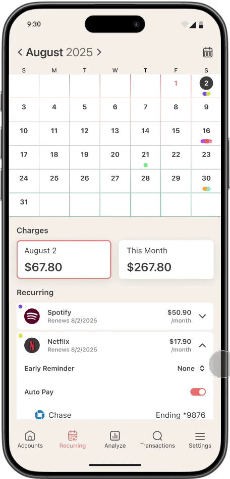
Users can toggle autopay on or off for each bill, view all linked accounts, and select account to be set for autopay.
Problem
Users struggle to keep track of bills.
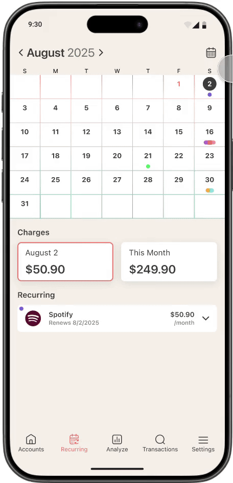
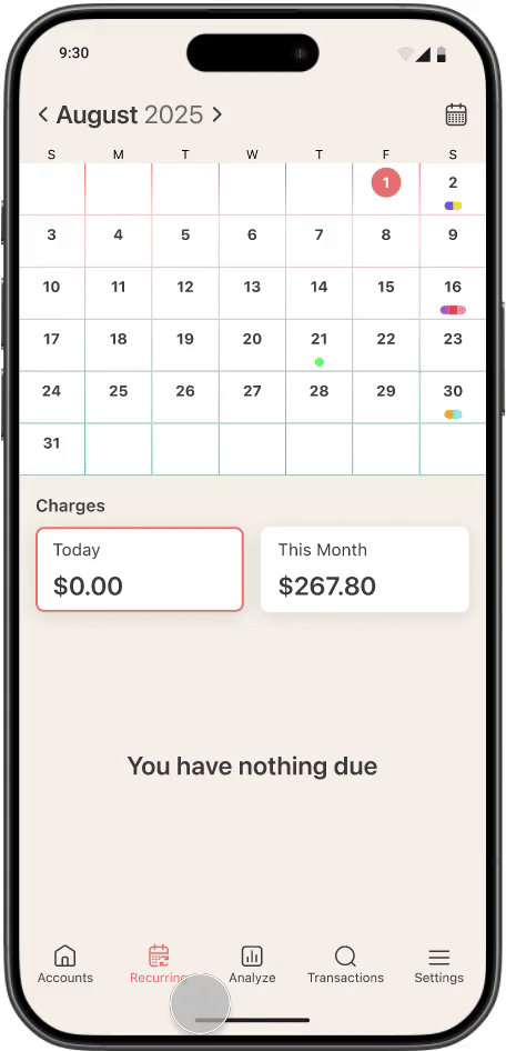
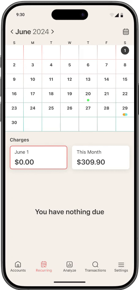
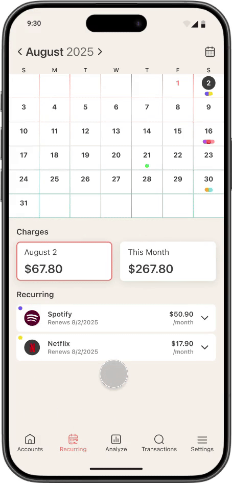
Solution
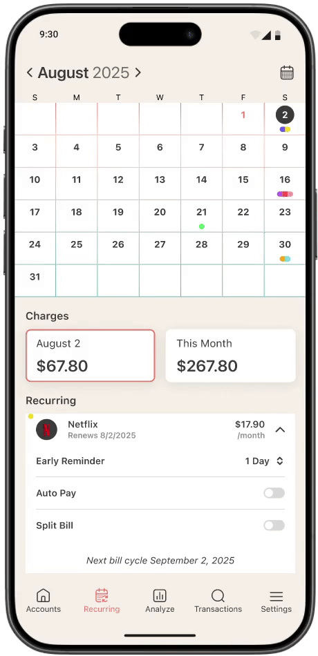
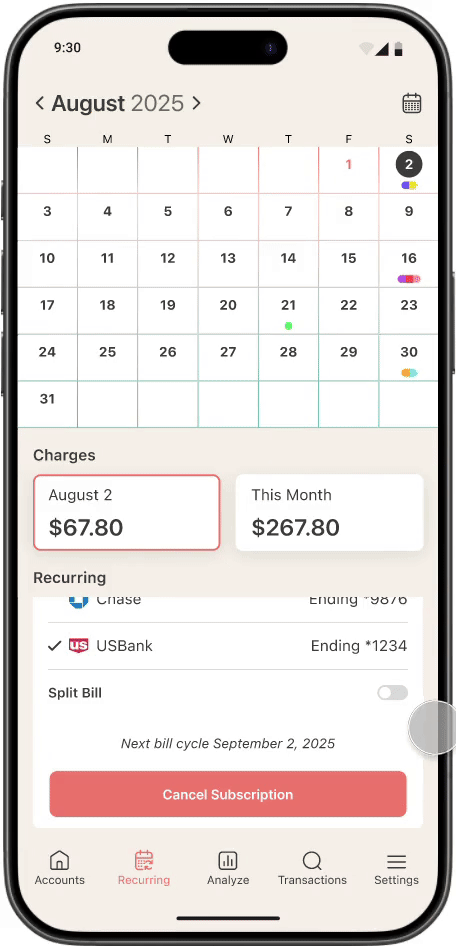
Users can select a day and it breaks down all bills if any that will renew. It will also show the total cost.
Problem
Users want the ability to see the total cost of all bills per month.
Solution
A card shares the total cost of bills for the month. When selected, users can see a breakdown of all recurring bills for that month.
Problem
Users lack control of custom notifications that will remind them ahead of time of recurring bills.
Solution
Users can set early reminders custom for each recurring bill that they have.
Problem
There is painpoints when a bill is split amongst two users or more.
Solution
Users toggle Split Bill on or off. They can add other users to the bill and will be reminded to send payment.
Problem
Unsubscribing can be difficult and annoying for users.
Solution
A Cancel Subscription CTA is added for users to easily unsubscribe.
High Fidelity
Key Takeaway
The key takeaway from the feedback was the importance of keeping the user experience simple and intuitive. Some elements were more complex than necessary, which created confusion. We also realized the importance of staying aligned with the core goals of the product—providing clear, accessible insights and making subscription management easy. The feedback highlighted the need to refine certain features to better support user understanding and streamline the overall experience.